Press-centre
11 august 2023
The changes of external environment and company’s anniversary, held under the motto “Time for new solutions” have given a strong boost to our development.
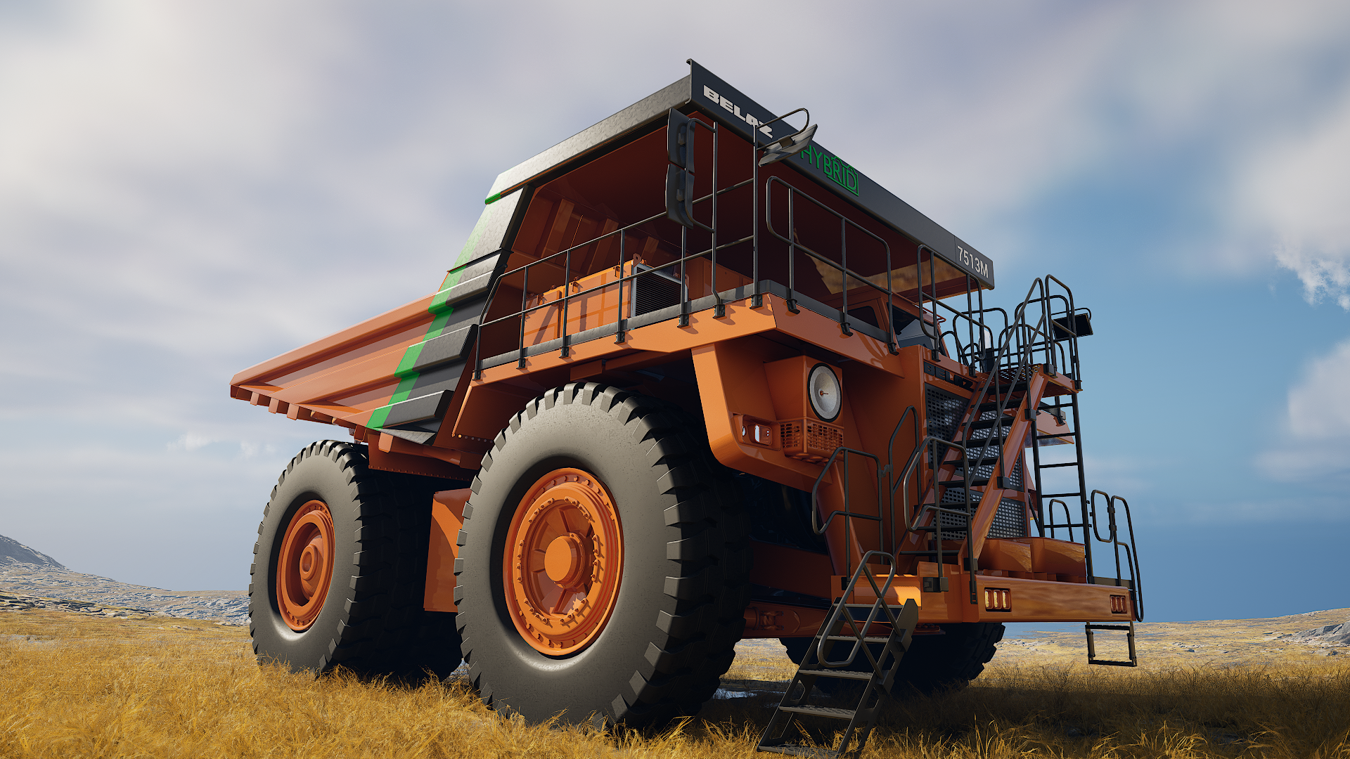
For the first time in the history of the plant we made a global reconstruction of main conveyer, created and passed to the operation tests of new types of equipment – battery-powered and gas dump trucks, developed and released technologically independent products – 130-tons hybrid dump truck and 220-tons dump truck with the engine of Russian production. Started assembling of the first crawler excavator.
From the innovative equipment – to the new corporate identity.
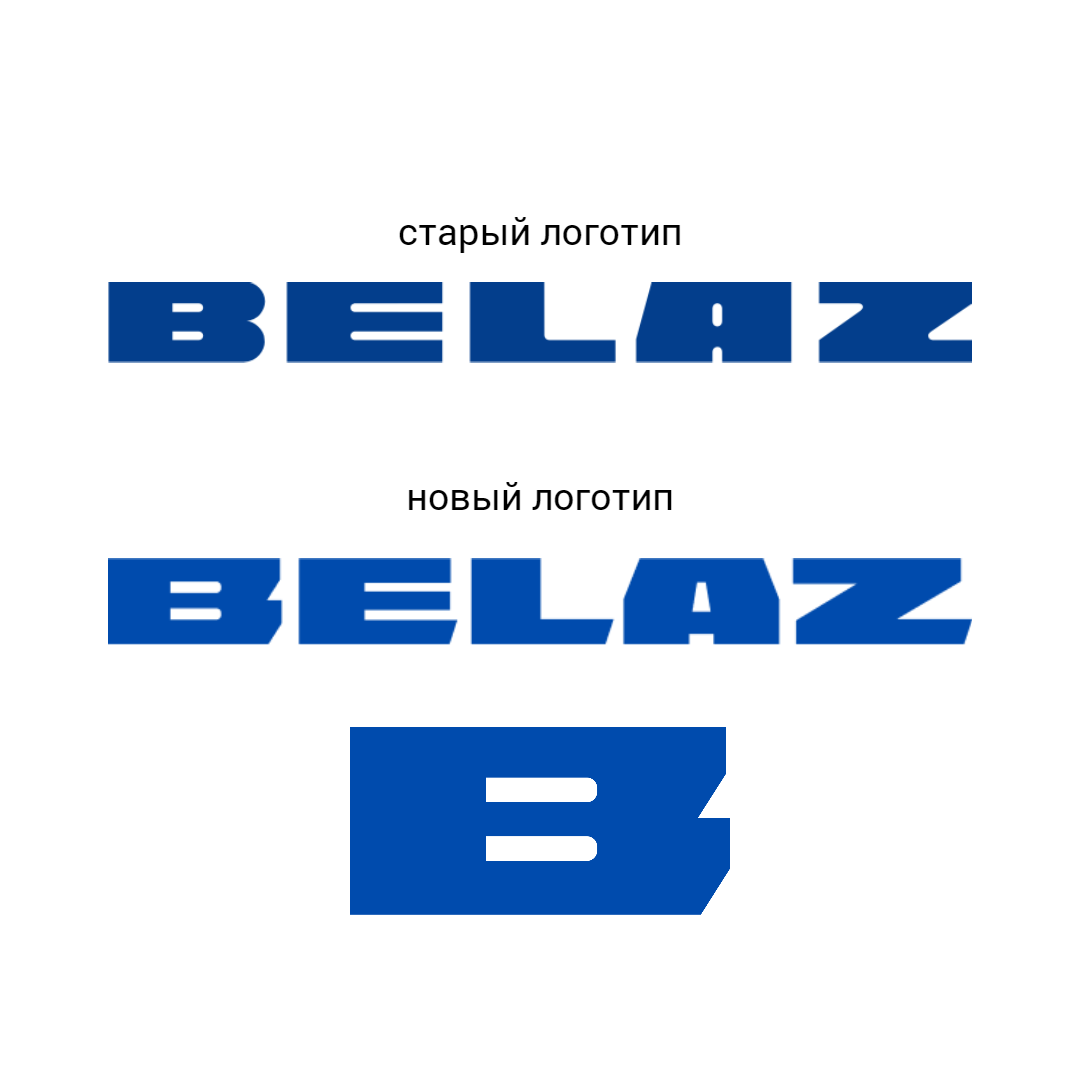

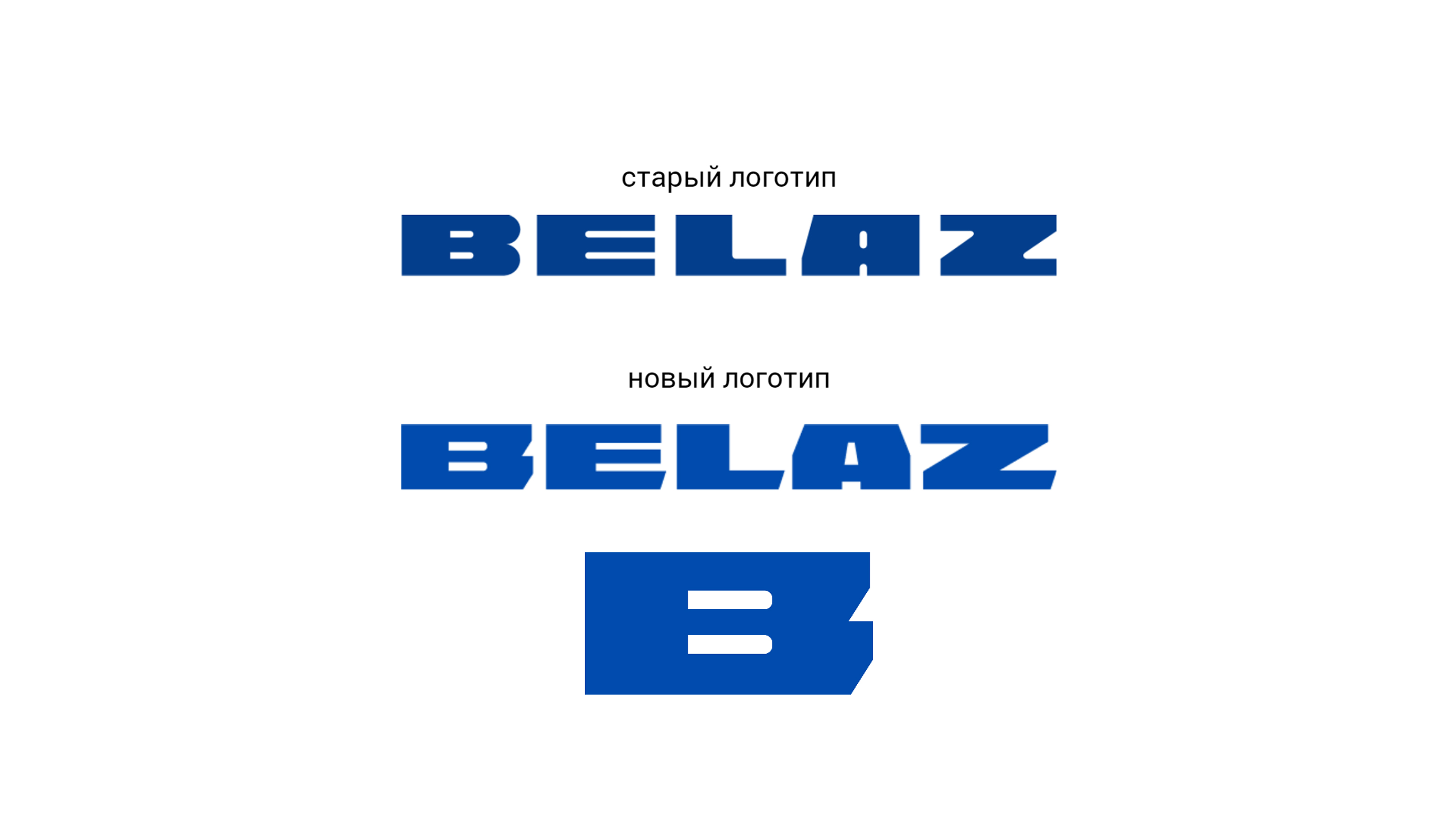
The logo of our company has a long history, but for over 60 years didn’t changed a bit. Soviet artist – designer Valentin Kobylinsky, created the plant’s logo in 1961 together with prototype of the first 25 tons dump truck. After a couple of years designer of design bureau of Belarusian automobile plant Vladimir Semenov gave more recognizable look to the letters and increased interval between them. From that time logo saved its form, and gaining more and more value and significance. Over time, it has become not just a trademark, but a household name that characterizes any dump truck.
Touching the history and to the heritage of our predecessors, we carefully developed traditional logo, giving it modern form and deeper meaning, that corresponds with zeitgeist. Updated corporate identity allows not only to attract additional attention to the brand and increase consumer and partner loyalty, but also show to the world that we are changing. High level of clients’ trust encourages us to always move forward. Innovative technical decisions to the production of mining equipment keep pace with the updating of the company, confirming identity of its brand.
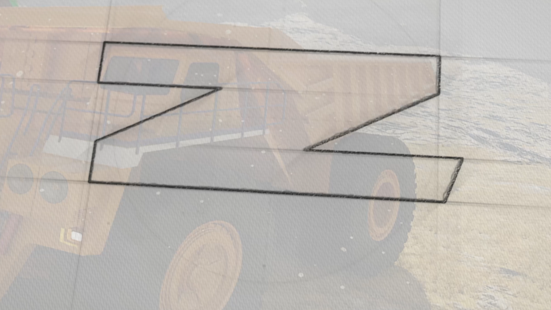
The updated logo look alike the previous, but it differs.
Even more dynamic. Even more forward-looking.
Similar in mass, muscular, the shapes of the angles of the logo letters echo the geometry of a modern dump truck. The corporate colour - blue - has become deeper and richer as a symbol of reliability and trust. Additional colours - orange and grey - are strongly associated with a dump truck and mineral deposits. And - most interesting of all - for the first time the BELAZ logo has a recognisable graphic element in the form of the letter B. As a constant, weighty and progressive, it resembles the image of a modern hero - powerful, intelligent and capable of feats.
We improve and grow.
Every new day is a new step to the confident bright future.
P.S.
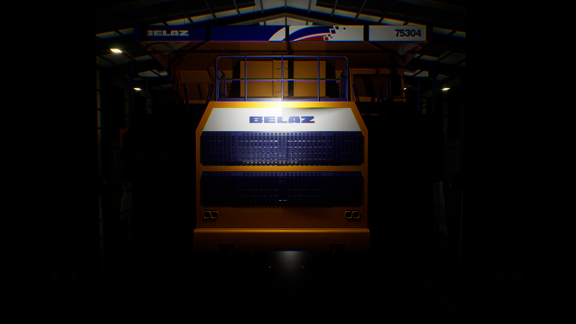
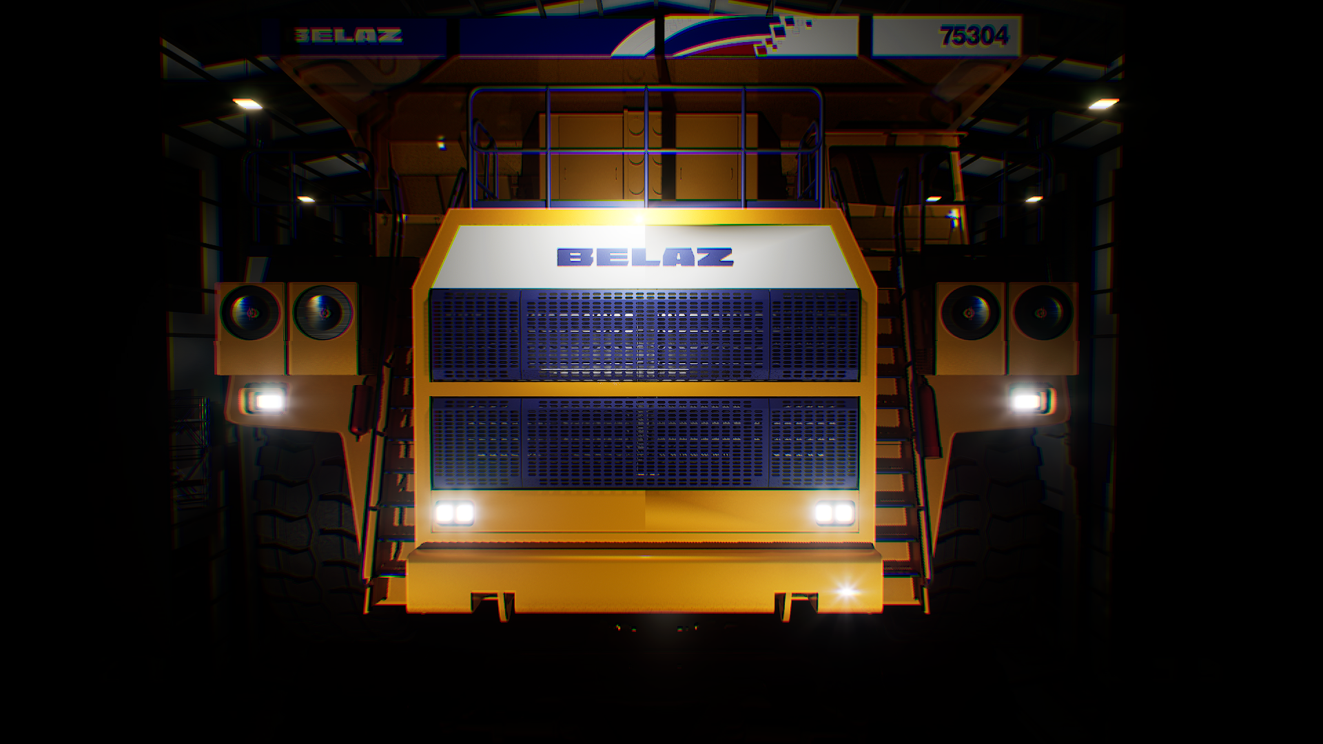
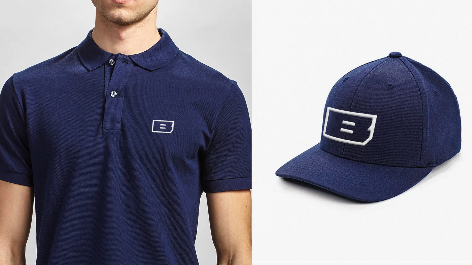
The elements of new corporate identity in the application.
news: